APRIL 16, 2019
A Recipe for a Satisfying Cover
Article by Pamela Rice — * Frequent Contributor
Putting time into the cover is just as important as the time spent writing your book. While coming up with a solution for your book cover, it is important to keep in mind a few things.
Ask yourself a few questions:
What is the target age for your book? The graphics should reflect the age group.
What is the story about?
Is there a main character(s)?
What is the title of your book?
How long is the title? and is there a subtitle?
Is the environment/location important to depict on the cover?
Will the main character be shown actively participating?
What will be your color palette?
What will be the illustrative STYLE you are going after?
Illustration:
Although hiring an illustrator can get pricey, their are many illustrators who will work with you. If cost is an issue, think about telling your story with LESS illustrations. Develop your pages with and/or without your character(s). Focus on nice backgrounds to link the story together. The benefit of having your illustrations done professionally, leads you to a wider, larger and more serious market. Think about the benefit of promoting your book with specialty items using your illustrations. There are bookmarks, T-shirts and other trinkets, not to mention being able to matte and frame the original artwork. Also, keep in mind, that your cover may not need a character(s). A beautiful type treatment and background can be just as attractive. You just have to figure out where the critical positions are throughout your book, to place the character(s).
When selecting a ‘look’ for your target, think about the composition.
Two things are important; the title and the main image. When designing for younger children, focus on a main character, try not to be too symbolic. Stay away from ‘clutter’. Sometimes too many color variations can become confusing, if not done professionally. If you have a main character and a lot of colors are used, put the color focus on the character important to the story (for example, bright red shoes on the character puts the focus on the wrong thing if they are not important to the story). Put an equal focus on the character’s face and expression, and secondly what they are wearing or doing.
What environment is the character in?
The character, while still important, is the foreground. Backgrounds are secondary. It should be obvious, but not overbearing. Tone it back with color (control color intensity). It should not be too detailed as to distract from the character. Have a few variations illustrated to see how the fine line between character and background works along with the type. There are illustrators that illustrated, but they may not always have the skills of composition and layout as it related to type.
When coming up with the title for your book, imagine it on the book cover. LESS is MORE.
Be precise and to the point. At a glance, a viewer should be able to read the title and not stand around to examine and decipher it.
The title should be as prominent as the graphics, but not competing. That’s the challenge. There should be a good balance. Here’s where composition comes in. There are many ways to incorporate a title on a cover. In an ‘arch’ across the top; and ‘arch’ across the bottom; incorporate the title within the cover art graphics. If the title is long, think about varying the size of the words, with an emphasis (larger) on the KEY words.
Consider varying the size of the title if it runs a little long with the emphasis on the KEY words.

Think about the FONT; the typeface to use for your title.
There are thousands of options. The fonts should pair with the content. It should not be TOO brassy, showy or irrelevant. As a rule, if you have a beautiful illustration, tone-down the font, as not to distract away. If your illustration needs help, choose a more decorative typeface (utilize sites such as myfonts.com). Sometimes it takes a while to find the perfect pairing…but look at it like this — once you’ve completed your cover, you’ll have to live with it.
Color
When selecting color for a children’s book, there are many non-professional illustrators who think “LOUD COLORS’ — not so. You don’t have to go ‘garish’ tonk-toy colors. View some of the books displayed at some of the better books stores. It will also give you an idea of which books stores put up front.
Once you’ve put all of your book cover elements all together, try many variations. Try variations using title fonts, title colors; positioning of your main character(s); and variations of your background. Print them out and stand back. Critique them. Put your ego to the side and don’t be afraid of critiques. Send them out to friends and on social media, labeled A – D, etc., let them act as your focus group. You want honest feedback, not compliments, you will get plenty of that. Of course, you will make the final decision, but feed back helps.
kidsShelf Books promotes a Quarterly Book Cover Contest via Facebook. It is open to authors, writers, and illustrators. It’s an opportunity to display your cover and earn a gold seal. It is featured and promoted for up to three months. On the submission form there is an option to have your cover critiqued, it cost nothing…it’s after the fact, but you have an option to re-enter it in the future.
You may think all of this is a lot of work, but it will be well worth it…when you blend most or all of these suggestions, you’ll find it is a great recipe for a satisfying cover.
 mmmm
mmmm 
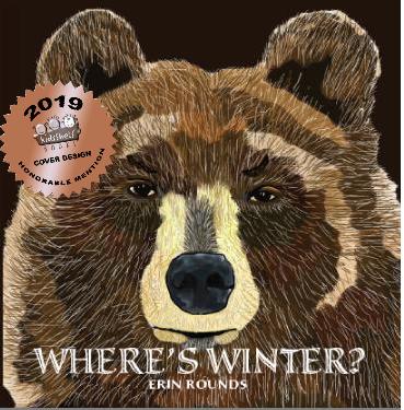
The composition and illustration worked. Suggestions was for a larger font size with an emphasis on the initial cap ‘W’ and ‘?’ Also moving the author’s name to top balances the cover. — Where’s Winter by Erin Rounds
 mmmm
mmmm 
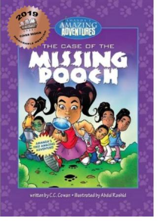
The Case of the Missing Pooch by C.C. Cowan – Illustrated by Abdul Rashid
Enlarging the main character was suggested; toning back the secondary figures. Moving the ‘starburst’ copy to a banner at the top which helps breaks up the purple color.


