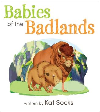
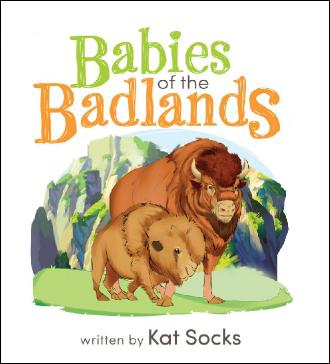
When deciding the visual for your cover —
If you are wondering about the content for your cover, don't stress out. Use elements from the inside of your book. The work is done, don't reinvent the wheel. Keep in mind, your main character might have a part to play. Now select a font that works well with your imagery. Your font should have character that reflects your book topic. Composition is important. There should be a relationship between the title and graphic.
Select a font that is not too overbearing, but that is complimentary with your character or image. The alternative is to select an interesting font and let that be the dominant factor.
The colors you select are critical too. The background color and the font color should not 'fight' with each other. Therefore the title should 'trump' the background.


When this author submitted her cover using the submission form, she checked the box at the end. In this box the author gives permission for me to make suggestions that might have helped in the decision. As you can see, the modifications are very slight.
1) Modified the position of the title
2) Made the initial caps LARGER to make it work around the shape of the mountains
3) Nestled the word 'Babies' centered and on top of "Badlands' and
4) Move the 'OF THE' into the space between
Now the title and image is composed and works as a UNIT...and it didn't take a whole lot. Play around with size, color and shapes.
Fortunately, the author had a very short first print run, allowing the incorporation of these suggestions in the second printing.
If you find yourself with questions, feel free to email me at kidsshelfbooks@gmail.com
Name
eMail
Message
mm
For the next edition — Click here for NEXT BLOG ONE | BLOG TWO | BLOG THREE | BLOG 4 | BLOG 5 | BLOG6